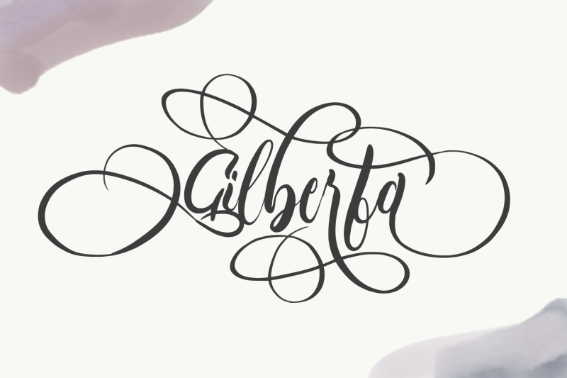
a lovely font for a lovely person. with so many beautiful alternates. also, come with bonus item 4 beautiful background
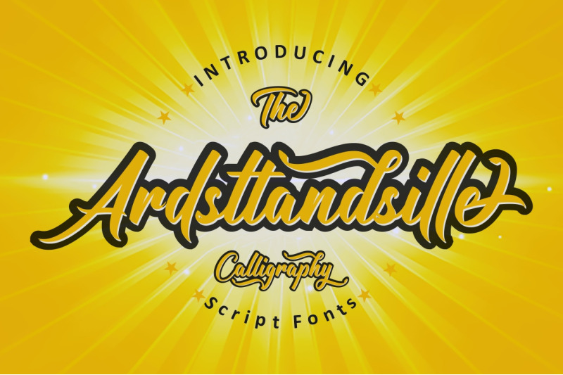
Introducing Ardsttandsille
Ardsttandsille is a bold and strong script font. carefully crafted with calligraphy. that contains many stylistic alternate that will help you to create your own customized design.
this font has unique and perfect for branding (Logotype) and other design needs, like for quotes, merchandise, packaging, business card and many other project.
Whats include :
Ardsttandsille OTF
Ardsttandsille Underline TTF
Features :
Ligature & alternates
Standard Uppercase and Lowercase Alphabet
Numbers and Punctuation
Stylistic Alternates
Stylistic Set
Open Type Features
Ligatures
PUA Encoded
Multilingual support AÀÁÂÃÄÅCÇDEÈÉÊËIÌÍÎÏNÑOØÒÓÔÕÖUÙÜÚÛYÝŸ?Ÿ
To access the alternate glyph, you need a program that support Open Type Features such as Adobe Illustrator CC, Adobe Photoshop CC, Adobe Indesign or CorelDraw
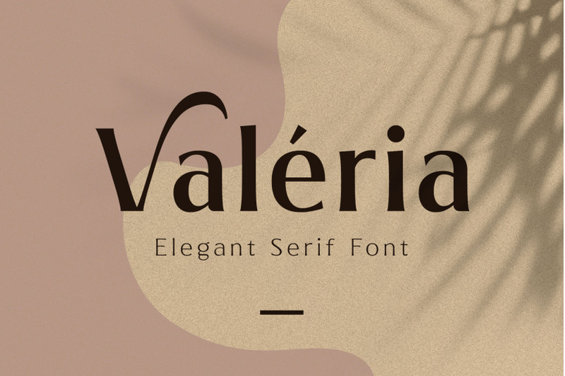
Valeria is an elegant serif font, designed with modern-classy style. Valeria has a high contrast of the strokes that gives the minimalist looks, the serif crafted minimal to makes the letterform more classy. Also, the letterspacing is set wide that looks so clean. Versatile and luxury!
Available in 3 weights that you can use it for a headline, sub-headline, and body text. Valeria is a great choice for a minimalist design such as book cover, magazine, cards, packaging, quotes, editorial needs, advertising, traveling needs, logos & branding.
Valeria completed with alternates and swashes on the uppercase letter that possible you can make a typographic text.
TTF & OTF format in a Zip file featured :
Thank you for visiting and watching, have a nice day!
Ramz.
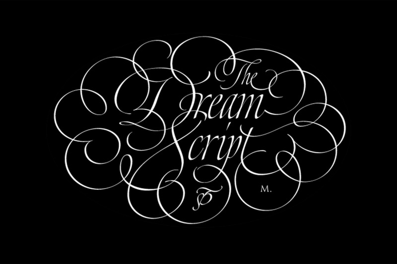
One of my dreams as a type-designer was making a good looking chancery cursive. Full of life, like some of the best calligraphers around the world do on their artworks.
With Julian Waters, John Stevens and Denis Brown (just to name a few of them) (1) chancery, or italic script, was transformed into a new, exciting and very fresh style of calligraphy mainly at the end of 20th Century.
Dream Script may be that dream named above made true. I have been practicing chancery in the way I learnt from those calligraphers for many years now.
Making a font out of my ink-sketches was a tough work, since they were closer of -being art- than of -being type-. However, this font rescues many aspects of handmade calligraphy: You have to look at it really close to notice it is actually a font, and that was one of my goals.
The secret of a good looking chancery is on its subtle details: pen angle is constantly changing, even on the strokes which seem straight. Capitals and swashes have to be done a little faster than lowercase letters. The rhythm has to be even, in spite of its playful look.
The fact that makes Dream look alive is that it has many alternates per glyph. This makes each word look unique like it happens in calligraphy: you will find alternates for the beginning/ending of a word/phrase, some for the middle of it, some interchangeable.
Also, to accompany the script, you will find Dream Caps, which was inspired in the eternally beautiful trajan capitals. Place them like I did on the posters and you will have great results for sure.
The font works great in small, middle and big sizes and can be a great election for magazines, wedding invitations, perfumes, and posters.
Close your eyes, and Dream with me...
TECHNICAL
Dream Script Pro is the most complete style, it contains all the alternates and ligatures (OT programmed, better if you use Adobe applications)
If you plan to use the font for text, be sure to activate the less decorative capitals, which are placed in the "salt" group of alternates.
Dream Script Standard has less glyphs than the Pro one, it contains just some ligatures for a better legibility. (OT programmed, better if you use Adobe applications)
NOTES
(1) Not only are they great artists, but also good people, who are always willing to share with their students all what they know. I would also like to thank Ricardo Rousselot, whose work inspired me this time to make "The Dream Script" exlibris; and to Alisara Tareekes, a very talented friend which international calligraphy conferences gave me: She kindly helped me with some tips to make this font better.
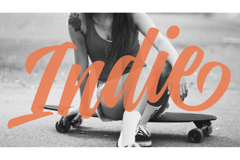
A FEW THOUGHTS
Indie is a trendy script, result of the wide range of possibilities that can be achieved using a pointed brush. (1)
“You Only Live Once” say The Strokes, (to me, symbols of indie music) so, what would represent that sensation of volatility better than a brush?
As you may already know, this time inspiration came from hipsters and indies around us: We may sometimes criticise them, we may sometimes want to be like them, but the truth is that the universo gráfico they generated these past years is gigantic, full of colour and variations. (2)
Brush lettering and Sign painting are fields I've been fond of since I started as a designer. Nowadays, these styles are getting a lot of attention and maybe it’s due to the undeniable mark of life that is materialised when using a brush. This tool is so expressive that shows the passions and fears of the artist, and materialises that idea of “living the present”, so popular in this era.
When you see Indie, you think of skaters, rollers, surfers, hiphop dancers, street artists, summer, and why not? California beaches.
So if you feel life is only one, it’s high time you got Indie into your fonts' collection!
STYLES
Indie comes in 4 styles plus another one which consists only in capitals. Indie; Indie Shade; Indie Shade Solo; Indie Inline are all open-type programmed and have exactly the same glyphs and metrics, so you can combine them without probem. (I.E. You may use Indie Inline, then write the same word using Indie Shade Solo, and finally put them together).
In applications such as Adobe Illustrator, the font has nice results when fi ligatures is activated. However, if you want a more casual look, activate the contextual and the decorative ligatures.
NOTES
1. After several years of practicing calligraphy I can say that to me, there’s nothing more satisfying than being able to create fonts out of your own handlettering. I owe a lot of this brush-style to Carl Rohrs. He was the very first calligrapher who taught it to me. His style is unique and what he can do with a brush is truly marvelous. I'm serious.
2. In spite of some particular cases, I can say I'm happy to live in a present in which Typography is living a kind of Renaissance along with Lettering. Like it happened with W. Morris a hundred years ago, handcrafts are being revalued/reborn, and some of this may be happening thanks to these indie designers that, trying to be unique, gave new/fresh air to different areas of graphic design.
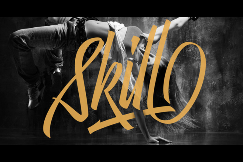
With Skill I wanted to create something wild. Something that splashed the letters with life. To do this, I knew I'd have to break the barrier between analog and digital, so I took my best brush and started to play.
Throughout the years as a type-designer I've met and become fan of many calligraphers. My belief that only a good calligrapher can make good typography (1) has become even stronger. I'm now absolutely sure that only practice improves the skill, especially in this field. So, with this in mind, I started a font which was a challenge for me because sometimes the gap between paper and screen can be gigantic.
Skill is another of my attemps (2) to capture the spirit of the pointed brush, its expressiveness, the passions and fears of the artist. This font is about freedom. Freedom everywhere. Movement, velocity, passion. To achieve this, many alternates and ligatures per glyph were designed. Use it on magazines, posters, book covers, music albums, t-shirts, skates, tattoos.
TIPS
Thanks to Open-Type, the font gives the user the chance to play and get many wonderful results: In example, using the font with “discretionary ligatures” activated will give more life to the written word. Some letters will jump of the base, while others will ligate or not with the following (typical of gestural calligraphy).
Adobe Illustrator is recommended.
STYLES
Skill is the most complete style. It has all the alternates and ligatures that can be seen in the posters and more!
Skill Standard is a variant with no decorative glyphs. It has the basic alphabet and some ligatures for better legibility.
©
Zinaida Aksakova
2014 . Powered by
Blogger
Blogger Templates
.
.